Projects / Personal Site Redesign
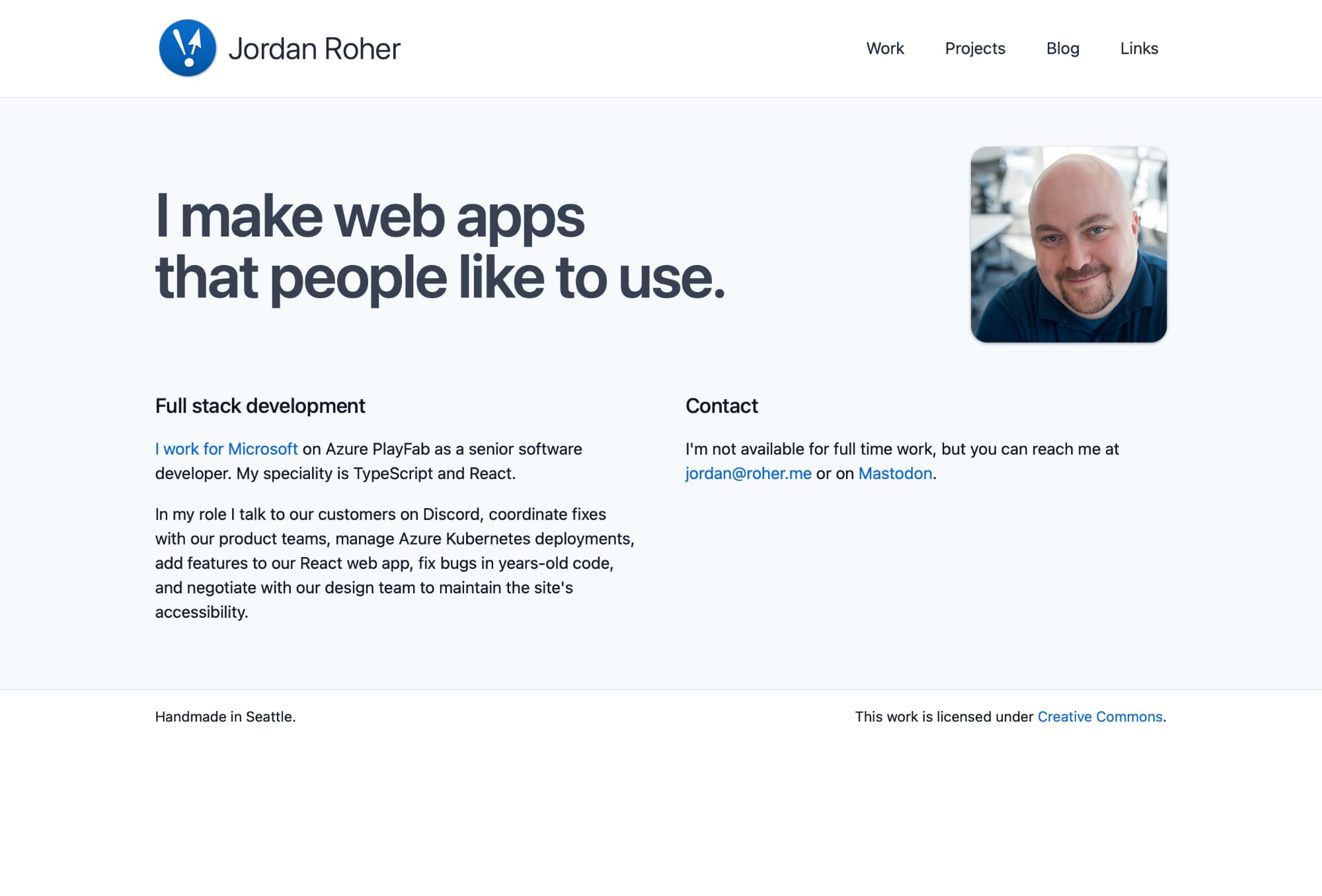
About
Jordan.Roher.me is my personal site, the one you’re looking at now.
2024 redesign
After getting into self-hosting and Mastodon, I wanted to go back to blogging. My personal site was functional, but I wanted to use the latest version of Hugo and see if I could do anything better.
There were lots of opportunities for improvement.
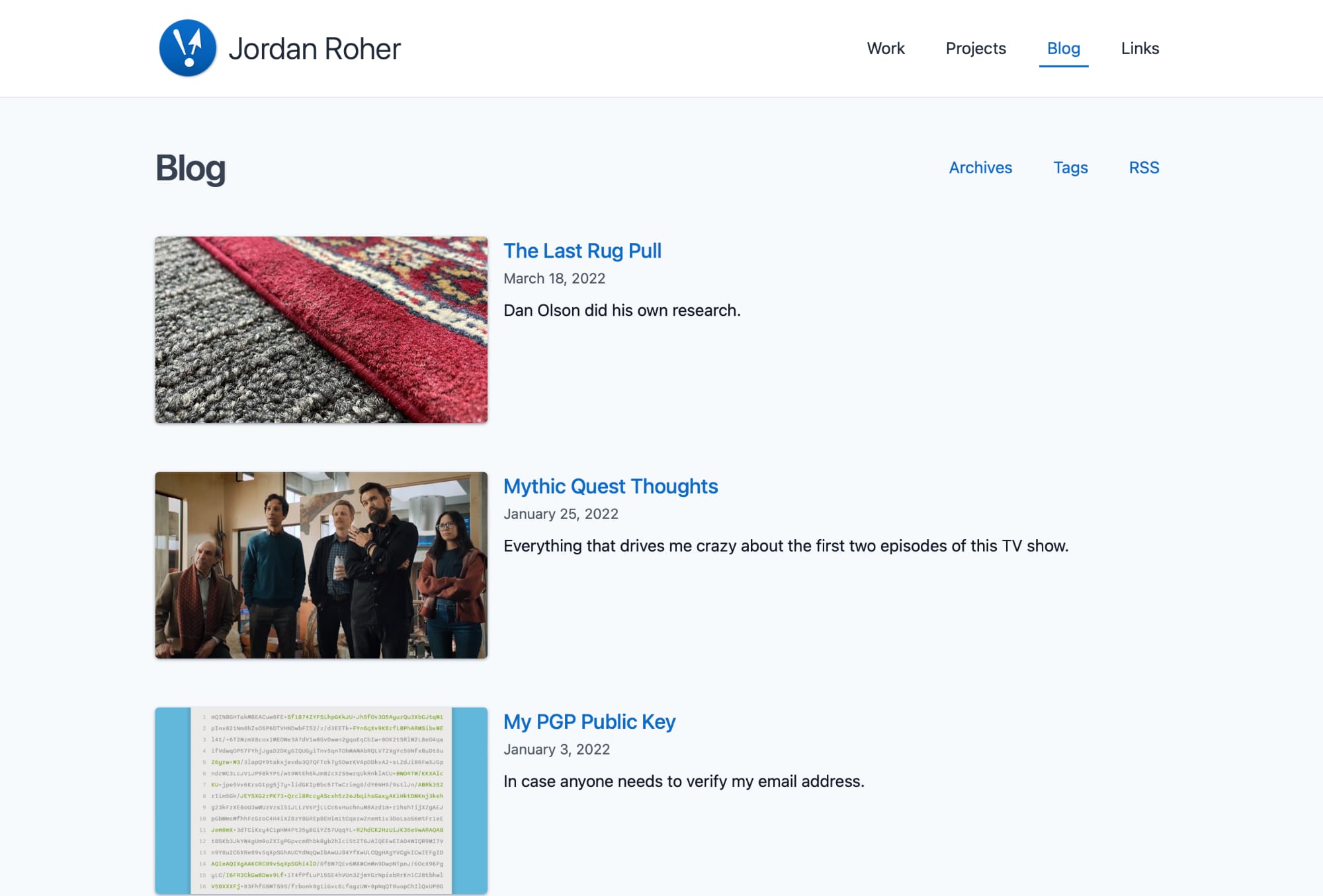
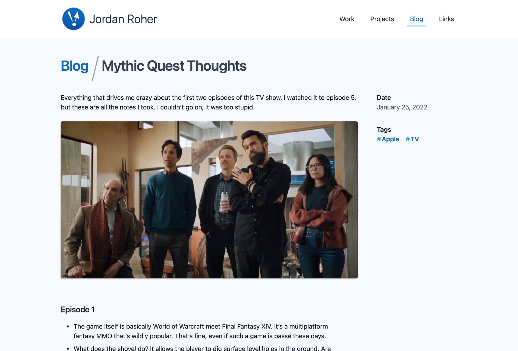
- Implemented DecapCMS to create a GUI for writing and posts
- Add images for all blog posts
- Removed my patchwork Hugo workarounds and used official methods for things like Open Graph tags
- Created a links section
- Styled site using Tailwind
- Shortcodes image consistency
Screenshots
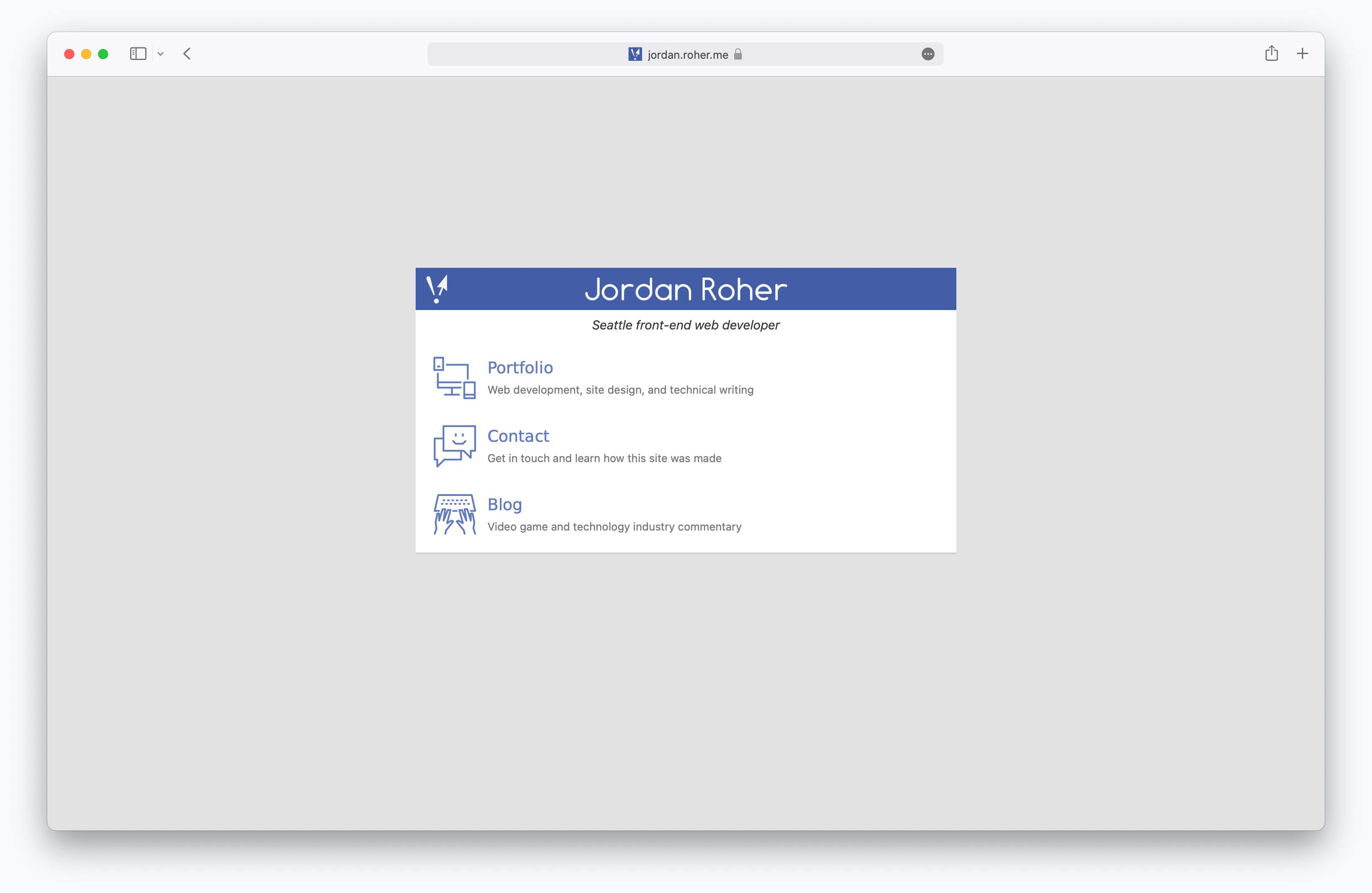
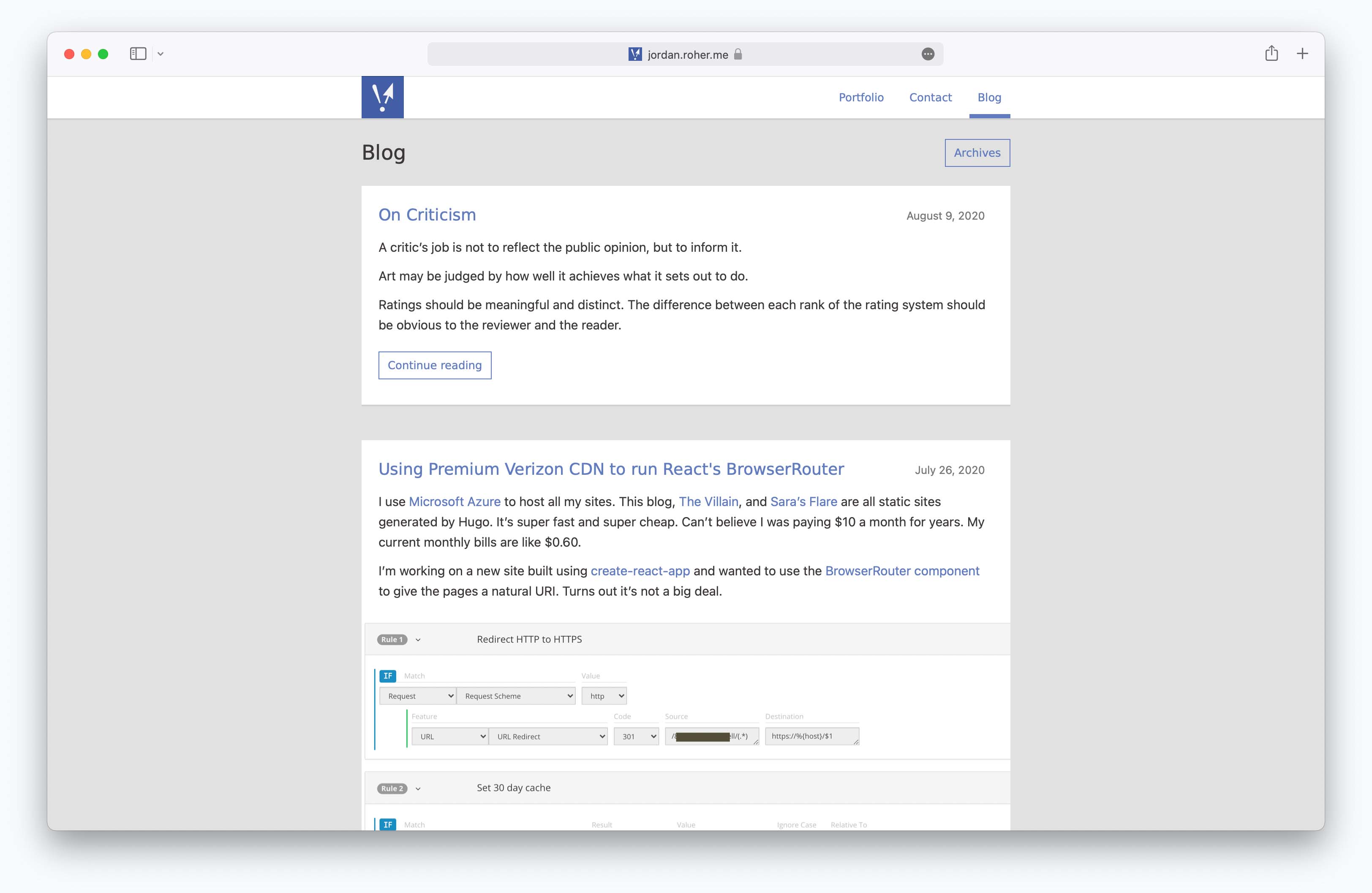
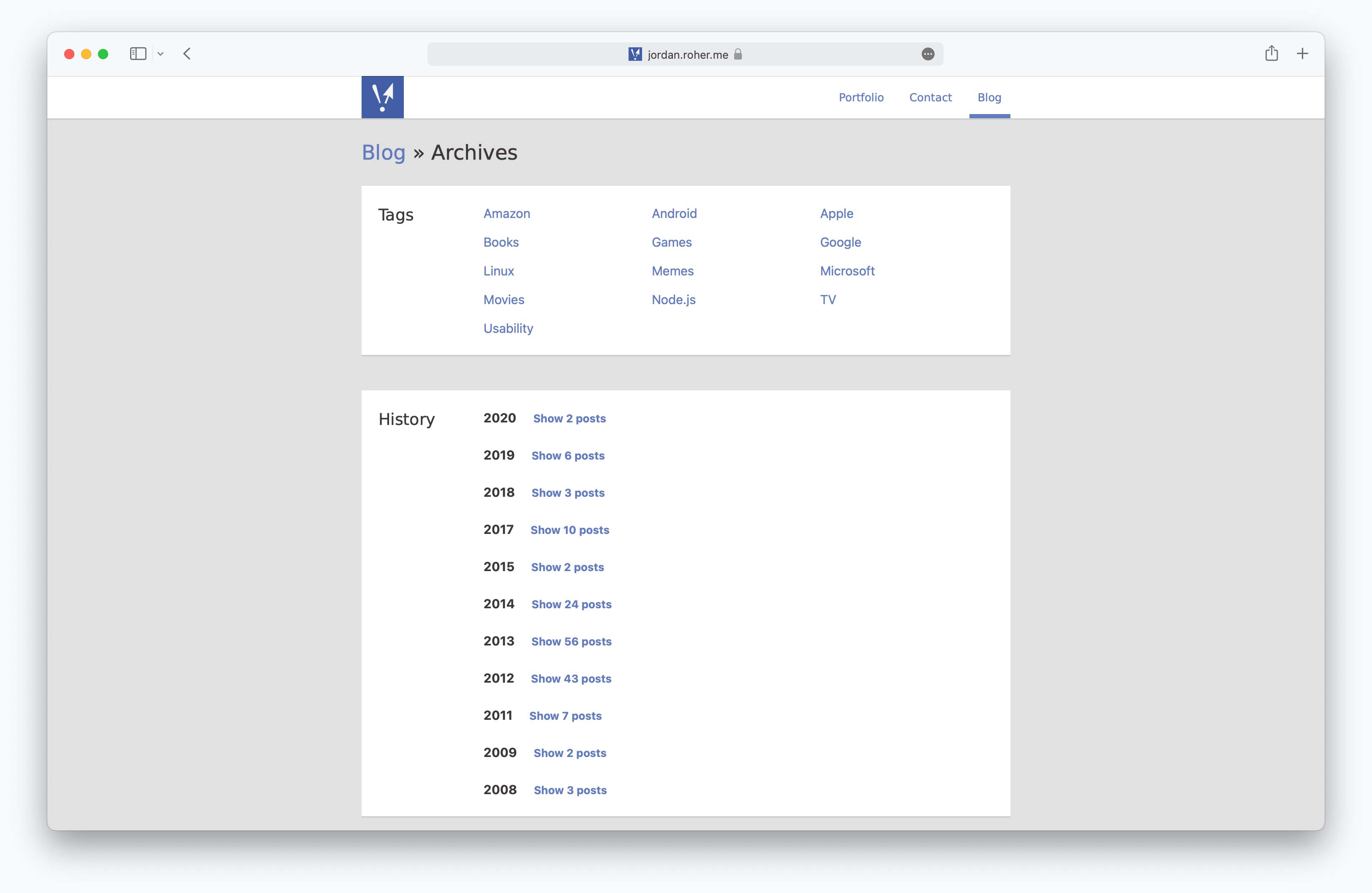
2021 redesign
In November of 2021 I decided to completely redesign my site. It’s been on the same design since *checks git history* 2008.
I figured it was due for an overhaul.
Build system
The first big change was the build system. I’ve used Grunt for as long as I’ve needed to build anything using JavaScript. I use it at Microsoft. But I wondered if I could build my simple blog without it. I’ve started getting into using npm scripts to do things. Could they replace Grunt’s functionality?
It took some doing, but yes, they could. I replaced my gruntfile.js with dozens scripts in my package.json. As a bonus, I added a watch mode. Theoretically removing gruntfile.js means one less file to manage. In practice I had to add two JavaScript files at the root of my project to handle the replace functions. It’s a fair trade.
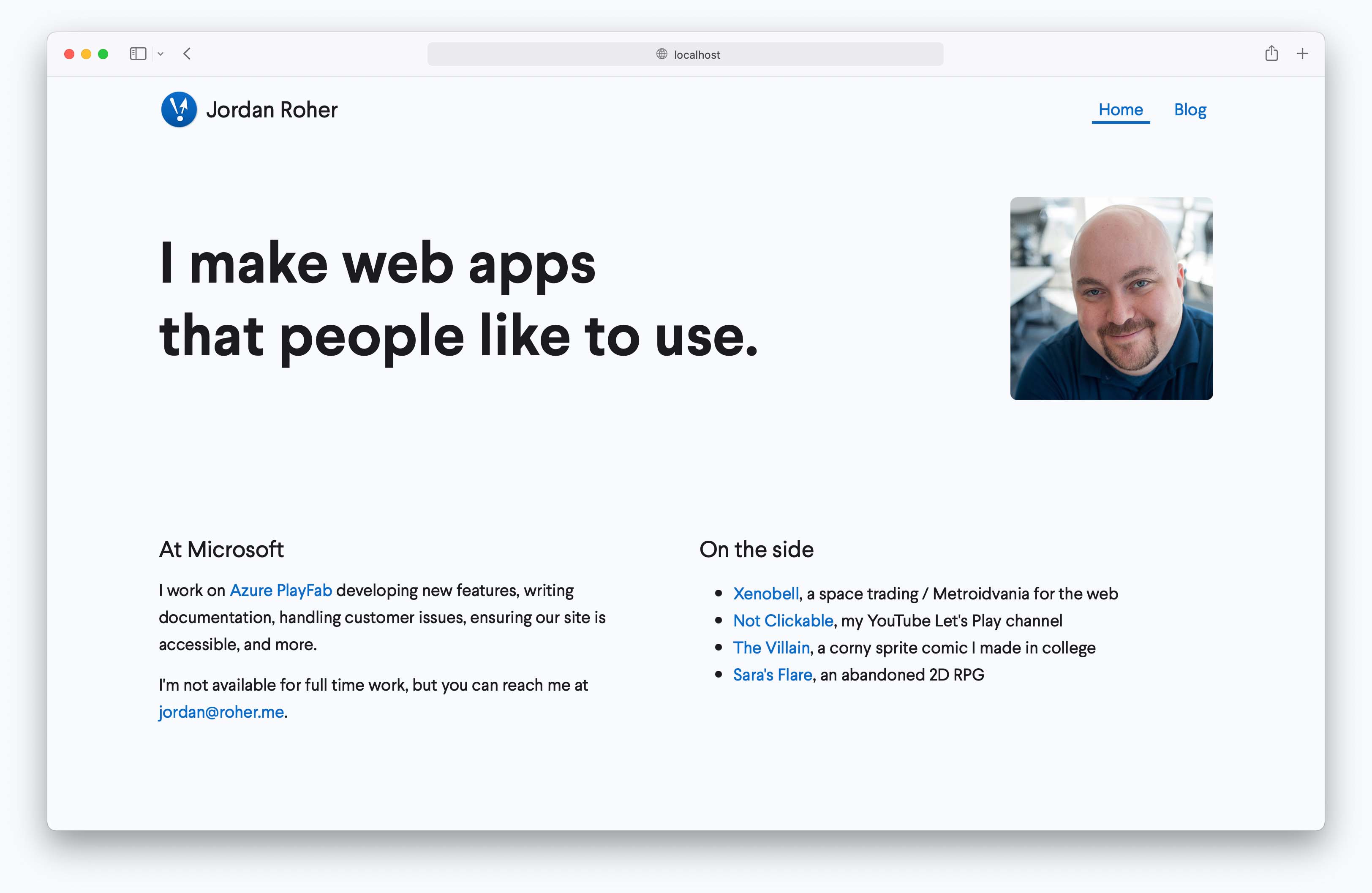
Front-end redesign
State of the art web design has come a long way since 2008. Clearfix hacks are out, CSS grids are in. I dismantled 95% of my site’s CSS and rewrote everything.
I wanted my personal site to feel breezy, approachable, and modest. I have a personal tagline I use on most other sites: “Seattle game and web developer.” But that didn’t feel right here. Other well-designed developer / designer sites go with a “I’m Vibram Toejam, surfer and heavy metal guitarist, and I move sweet pixels” vibe. I’m not that cool, but I have my own words.
White space replaced most the borders I used in the previous design. There’s still one in the footer where I embrace my “Apple packaging tagline” mantra. Big fonts are the other modern trend, but I had a hard time finding a good balance for the headlines.
I also worked on removing the number of pages in the site. The blog’s archive page is gone and so are the dedicated contact and portfolio pages. Now the home page is enormous. It’s partly to reduce clicks and redundancy, and partly to ensure the content doesn’t get too wide.
The font for this site is Larsseit.
Screenshots