Blog / Is there any life in the Vita?
The biggest shock in the technology world will be when Apple snaps and turns evil. The next one will be when Sony becomes good.
You remember Sony, right? The company that installed a rootkit when you played their audio CDs. Then lied about why the Sixaxis controllers didn’t rumble. Removed PS2 compatibility from the PS3, then Linux support. Took over a month to get the PSN back up after it was hacked. Hiked the price of Whitney Houston’s music 30 minutes after her death.
Yeah, that Sony. And now they’re back with a new toy that… hey, where are you going?
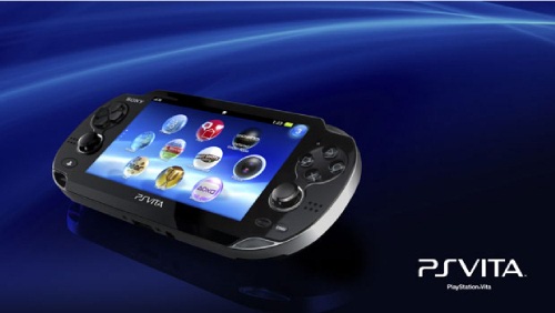
The Playstation Vita is their latest handheld game console, entering a world filled with Nintendo’s lackluster 3DS and booming sales of iPhone games. What has Sony learned from Apple, the current consumer electronics champion? Well, that touchscreens and cameras and gyroscopes are great. Nothing else.
Certainly nothing about the unboxing experience. The Vita arrives in yet another text-heavy cardboard box that unfolds like a 3D puzzle and has plenty of pointless promotional slips of paper inside plastic bags. The power cable is nice and long, but it feels cheap, and the power brick is so light that it feels empty. It should be halfway between the size of the iPhone and iPad power brick, but it’s bigger than both of them put together. Either it’s because Sony thinks we’d misplace something so small, or it’s some kind of weird real world skeuomorphism. The Vita is more powerful than the PSP, and the PSP had a large power brick, so this one should be about the same size, even though technology has advanced where it doesn’t have to… right?

Fully charged, you find the Vita power button on the top of the device and press it. Nothing happens. Press it again, longer. Still nothing. Is it broken? No: you need to hold the power button for a full five seconds before the device turns on. This would be to prevent accidental activation in a pocket, but the power button is very nearly flush with the device. It doesn’t stick out like the iPhone’s power button. It would be a point in the system’s favor (hard to accidentally turn off!) if Sony didn’t realize that makes it hard to turn on, and therefore you don’t have to sit for five seconds every time you want to power on the machine. That’s the amount of time you hold the power button to force a shutdown on most smartphones when they misbehave. For the Vita you’ll be doing it every day just to turn on the thing.
But once it’s on, you appreciate the magnificent five inch touchscreen. Colors are crisp and the pixel density is in retina range. Its touch response isn’t as smooth as an iPhone, but it’s better than the old Android phones and does the job. The screen itself is plastic and picks up oils and fingerprints just like every other device. Sony is being either cynical or practical by selling screen protectors at launch. I didn’t pick one up.
I did get an 8GB memory card. It’s about the size of my index fingernail and fits into a tiny slot below the right thumbstick. That this is a Sony machine makes it almost redundant to say that yes, of course this is a new proprietary memory format designed to hinder piracy. Game saves are similar to existing console sizes, so you’ll be fine with a small cartridge unless you intend to download retail games from the Playstation Network. You don’t want to have to swap these things. I could swallow a 32GB card and not notice.
Which is weird, because there’s lots of noticeable issues with the Playstation Vita. You know how you bought an iPhone, took it out of the box, then logged into the App Store and started downloading games? You can’t do that on the Vita. You need a firmware update first! You can’t even put in your Playstation Network credentials until your device is up to date. Which means that zero people buying a Vita on launch day will be able to successfully complete every step in the initial setup procedure. Sony is disappointing their best customers. Unbelievably stupid.
But wait, there’s more!
- You have to set the time on the device manually before you connect to Wi-Fi. And then once you’re online it sets the time automatically, wiping out whatever you entered. Stupid.
- The Vita plays this elevator music all the time by default. At the top of every “Vita Buyer’s Guide” are instructions for turning off the infernal tunes. Nobody wants it. Why would they include it? Stupid.
- The charging battery icon is animated, flickering in the corner like something dangerous is going on. Why is it animated? Why doesn’t it just show a power plug inside a battery like iPhones and Androids and Blackberries? Stupid.
- The touchscreen keyboard has the usual QWERTY layout for letters, but its numbers and symbols interface is half normal (e.g. iPhone, Android) and half telephone. It puts the hyphen and @ symbol on the telephone side, huddling behind a grid of numbers. Worse, the other symbols are split into 2-4 pages. Instead of… oh, I don’t know, putting the numbers on the top row like a normal keyboard and dropping those extra symbols into the layout’s extra space so it wouldn’t use multiple pages? Stupid.

That’s the bad parts of the interface. I can find a few things to praise.
- Privacy choices are straightforward. Who gets to see your friends list? Easy: no one. What about activities? No one. I don’t know the kind of person who would turn them on, but they’re easy to turn off.
- I like how you can rearrange apps on home screens wherever you want, leave gaps between icons, and set different backgrounds for each screen. The Android users in the audience are smacking their foreheads. DUH! But we iPhone users are a primitive tribe, as our home screen faithfully emulates Windows 95’s desktop, where icons are helium balloons in a western wind. I’ve made three clean home screens that look great and work well for me.
- Quitting games is effortless. Just press the PS button and swipe the screen away. Feels even smoother than quitting iPhone games. Kind of sickening that this is a point in the Vita’s favor, huh?
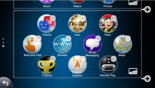
Every time you pop in a new game it installs an icon for itself on your home screen. Then, once it’s finished installing, it bounces up and down in such a manner that Apple’s OS X dock gets embarrassed. That icon also bounces whenever you put the game in again. But if you tap on something or change screens, the icon stops bouncing. There’s no way to tell which game is inserted other than removing the cartridge or tapping every game to see which one works. It’s a sign of Vita’s awkward bridge between the physical and digital worlds. Sony expects you to buy games online, where there is strong DRM and prices never change and the used game market doesn’t exist.
Some games, like Super Stardust Delta, are only available from the Playstation Network. Others like Wipeout 2048 have online passes to put pressure on used game retailers. It would be less aggravating if the game didn’t throw up a dialog box every time not-so-subtly hinting that online play requires an online pass. And every time you download something the Vita asks you if you want to share that activity with people near you. Who would? Even the neediest attention seekers would think twice before announcing
I JUST DOWNLOADED THE FLICKR APP ON MY PLAYSTATION VITA!
PRETEND TO CARE ABOUT THIS!
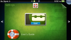
Sony solves the issue of game updating, product manuals, and social interaction in a weird way. When you tap an app icon, it doesn’t launch the app. Instead you’re greeted with a “LiveArea™,” which is kind of a splash screen on steroids. There’s a button in the middle to actually launch the game (or settings or whatever), and surrounding it are icons to bring up the manual, download a patch, or get DLC. Every app kind of becomes its own storefront. It’s not a terrible idea, but it’s strange that they decided to solve this by interrupting the player rather than make it an option in the game menu. I’d wager that most people want to launch straight into the game when they tap an icon. Prompt the player to download an update, sure, but the rest of them function better as “Leaderboards” or “How to Play” menu options that experienced players can ignore.
Technically the Vita has an Internet browser and a photos app to use the dual cameras to take pictures. It can play MP3s, watch videos, and display Google maps. If you use the Vita for any of those functions, I seriously hope your phone just broke. Because if not, if you bought this thing to be anything other than a game device… well, I guess it’s got to be better than your N-Gage.
Those buying this to play games will be pleased. The Vita has a pleasant heft and perfect balance. It doesn’t get warm when you’re playing 3D games. Its buttons are small but clicky, and the D-pad moves with precision. Oh, and there are two analog sticks.

In the same way that drenching Harry Knowles with water doesn’t start a wet t-shirt contest, putting two analog sticks on a Sony handheld doesn’t make it a DualShock. They’re much better than the PSP or 3DS circle pad, but they’re not precise enough for a first person shooter without aim assistance. Not that I expect this to stop EA from releasing a Call of Duty title for the Vita. The system isn’t worse off for having them, but it’s not the solution to all our problems.
I’m particularly fond of the rear touchpad and the gyroscope inside the Vita. Having played a lot of rotating iPhone games, I’ve found the Vita’s sensor to be more accurate and faster to update. The rear touchpad is easy to activate accidentally, but it works great as a secondary navigation option. Use it to spin 3D models without obscuring them with your finger in Wipeout 2048. I can imagine it used for actions like blowing wind, slashing swords, and lifting levers. It’s not nearly as precise since you can’t see what you’re touching, but it could be great for broad gestures.
Once you start up a game the Vita’s annoyances fade away. Wipeout 2048 has the frantic gameplay you remember and gorgeous PS3-caliber graphics, but something was lost in translation. The Vita’s screen just isn’t big enough to be able to see what you’re doing. The ships in Wipeout are miniscule, going from a pixel in the distance to a rear-end collision like a bug splattering on your windshield. Wipeout’s interface uses the front touchscreen to great effect, with the rear touchpad spinning ship models and bumping the decorative background.
Much as I adored it on the PSP, Lumines feels like a weird game on the Vita. It’s just a puzzler involving rotating blocks, similar to Tetris. Its main mode starts slow and gets faster until you run out of room, just like Tetris. Why are you paying $40? Umm, the licensed soundtrack and the extra modes no one cares about. This could have been a $10 downloadable game and everyone would be a lot happier. Since the original game didn’t even stress the PSP, the Vita’s horsepower feels wasted. It also introduces this mild 3D effect that somehow makes the graphics worse. But I found the string in my brain that it tugs and was pulled back into its depths.
As my first Rayman game, Rayman Origins feels really weird. Oh, it’s lots of fun to play, with beautiful art and smooth controls and a great sense of humor. But the justification for what you’re doing seems context-free. You know how Mario collects gold coins and Sonic collects gold rings? Like, real things that a humanoid might collect because they appear to be items of value? In Rayman you collect yellow bugs. Sometimes you collect a big yellow bug and then the small ones turn red and start singing. Are they worth more now?
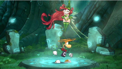
I’m not sure what to think of the plot. Rayman and his three buddies were snoring so obnoxiously that a bunch of dark subterranean creatures invaded and captured you, but then you press X to escape and… then… run around? The baddies don’t seem to be hurting anybody. Am I saving the yellow bugs from the dark creatures? Not that Mario’s “save the princess” and Sonic’s “save the forest creatures” plots are Pulitzer Prize material, but they feel like acceptable excuses to save the world with jumping. I wholeheartedly recommend Rayman Origins, I just can’t figure out why I’m doing what I’m doing. Maybe this was easier to accept when we were children.
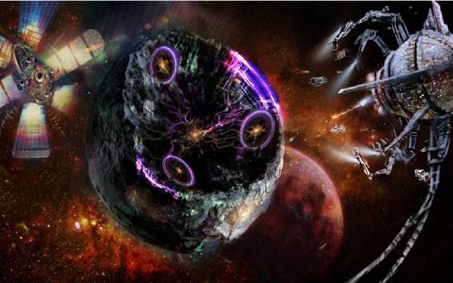
Super Stardust Delta was the only game I bought from the Playstation Store. It’s functionally the same game as the PS3 version, with the addition of new screen clearing weapons and two guns (fire and ice) instead of three. Unlike Wipeout 2048, the game makes its transition to a smaller screen successfully, though the pyrotechnics will still cause you to get blindsided by a pebble every so often. Just be glad you don’t have to insert a coin to continue.
I think Stardust could be a really powerful franchise for Sony if they built on the arcade shooter’s foundations. The graphics are so realistic that I find myself spinning a plot from whole cloth. Why am I piloting this little ship shooting ore? Am I a miner? Can I take these points back to base and buy new ships and armor? Who are the aliens that invade and attack me? Are they part of some evil galactic empire or sentient creatures defending their territory? Is there really a force field around the planet that I’m coasting on, or is it just a function of gameplay? It feels like it could be a minigame in the Halo universe.
What’s to become of the Vita? I’m not sure. Its launch lineup is more solid than the 3DS, but the standout Uncharted game is getting mediocre reviews. Everything else is a port or incremental update to an existing franchise. Gravity Rush looks interesting, but it was pushed back several months. Sony’s poor UI design means this isn’t a device you’ll enjoy using out of gameplay. Personally, I’m excited about what will happen when hackers break the device’s security to run unapproved software. The Vita may become the greatest portable Super Nintendo emulator ever made.
That’s not quite a death sentence, but it’s no way to live.
