
Blog / At the Nexus of madness
My first day with the Nexus 7 included two epiphanies. “Oh, I get it now,” spoken slowly. Then later and more frantically, “how do they live like this?”
Yeah, it’s bad. But not all bad.
I’ve dabbled very briefly in Android before: gawking at other friends’ huge phones, trying to help a coworker get her mail widget working, drooling over the esoteric 8pen keyboard. An iOS stalwart since the early days, I’ve always wondered about the grass on the other side.
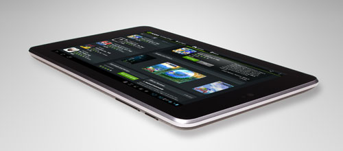
Hardware
For the price - or even 50% more - the Nexus 7 hardware is hard to fault. It has a great screen and a decent mono speaker. The front-facing camera is kind of big and noticeable, but it helps you orient the device since there are no physical buttons at the bottom. I’m annoyed that the USB plug at the bottom doesn’t fit any of the cords I already have. Yet the weight and balance of the device are perfect, and the back has this delightful rubberized texture that’s a joy to hold. It feels like a car tire that’s been sanded down to meet the specs of the human hand. While I rush to cover my iPad in Ghost Armor because the metal back seems scarily scratchable, the Nexus 7 feels fine under my fingers.
I’ve read complaints about the box the Nexus 7 comes in, but as a seasoned Nintendo and Sony unpacker I can say there’s nothing egregious about the way it unfolds. It’s all very… black, like Cathy’s purse. And Google’s Internet mindset means you’re not inundated by a dozen little slips of paper. Just e-mails. Tons and tons of e-mails as you activate the device and buy apps. I think I understand why Apple waits several hours before sending a “You bought this app” e-mail. It’s because having your device buzz 45 seconds into your new game experience can be alarming.
Software gripes
Today the Android/Apple argument is about whether Samsung ripped off the iOS interface for their Galaxy phones (or whether Apple legal is smoking crack). But years ago it was more fundamental: was the Android interface a reaction to the iPhone, or did they always intend to make a capacitive touch phone with a giant screen and no keyboard?
I always thought the former, but not with any sense of indignation. Why wouldn’t they? Touch is the way to go! Yet you can see remnants of a menu-based interface if you look, tiny weeds sprouting from the cracks in a driveway.
Scrolling
Scrolling is still a problem. After Project Butter it might be the best it’s ever been, but it’s still troublesome. It’s not the frame rate, you guys, it’s the way my touches propel the screen, or rather the way they don’t. Acceleration feels wrong, usually moving me shorter distances than I intended. Movement lag is still there, and greater than the iPad, but what’s really odd is how exacting the scrolling wants to be. If you move your finger very slowly down a webpage, it jerks down in very perceptible single-pixel increments, like nudging a layer in Photoshop using the arrow keys.
You know why Apple is suing Samsung over the bounce-back effect when you scroll to the bottom of a page? Because without it the whole illusion falls apart. Google has a few methods to show you’re at the end of something: the icons will rotate slightly, there’ll be a blue glow, or my personal favorite, nothing. The interface just stops dead with you pawing at the screen like a dumb puppy.
Store
Google wisely gives you a $25 credit to the Android App Store when you buy a Nexus 7, which means your first day is full of shopping in giddy abandon. Coming from the puritianism of the iOS App Store I’m flabbergasted to find Super Nintendo emulators sitting right next to Angry Birds. You can download alternate keyboards, home screen launchers, and even porn! The mind reels!
Fittingly, these illicit goodies are framed by a second-rate interface. The “Featured” tab of the Google Play App Store has incredibly cheesy backgrounds for “Editors’ Choice” and “Staff Picks” buttons. The colors are dull greys and greens. It just looks like nobody cared very much about the graphical design of the store. Maybe that’s a contributing factor to the problems with monetization on Android. If I didn’t have a $25 gift card burning a pixel in my e-wallet I’d be wary of the flea market atmosphere.
But Google provides great competition to Apple in its app reviews. Dumb doesn’t begin to describe it. Here’s an idea for a record breaking Kickstarter: find the cretins reviewing these apps for iPhone and Android and pit them against each other in a kind of Upper class Twit of the Year competiton. You can count on my four-figure contribution.
Paradigms
If I didn’t have exposure to the Android interface before using a Nexus 7, I’d be terribly confused.
The icons on your home screen aren’t actually the apps themselves. They’re just shortcuts. You have to go into Settings > Apps to uninstall one. While you can give labels to folders, you can’t see those labels if the folder is in the dock. I spent two minutes swiping back and forth trying to figure out which home screen I was on, as the blue glow in the bottom grey bar is really faint if you don’t know it exists. The app switcher button is very cool and visual, but the back button doesn’t work on the home screen. You can have app icons that take you directly to the app, as well as widgets - that look exactly like app icons - but take you elsewhere.
And then there’s the settings menu, which gives you detailed breakdowns of what app is eating the most battery time. I can see why Apple’s coy about these sorts of details. Even in the modern era when Android task killers are recognized as quackery I get a little itchy when looking at the precise culprit of my dwindling charge.
Apps
If you spend as much time getting brainwashed by Apple pundits as I do, you’ve heard about how crummy Android apps are. Well… erm… they’re right.
I realize the market for 7" tablet apps is in its infancy compared to the phone market, but even the best apps I’ve downloaded are poor competition. Google Chrome, beloved on the desktop, is miserable on the Nexus 7. I can’t seem to hit any of the UI elements on top with one try. Google Reader is plain and utilitarian compared to the iPad’s Reeder app, and BaconReader is no competition for Alien Blue.
It’s not for lack of features. They do work as advertised. Things just feel dry and soulless when I’m using Android. Even on my current home screen I can see a little of this. The Calendar widget has a title bar with a mild 3D effect, like it’s popping out of the screen. Next to it, the Gmail widget is flat and grey, like it came from an earlier version of the OS. I know DoubleTwist bucks that trend with happy shiny designs, but I have no use for any of their apps.
Thus my Nexus 7 is a dedicated development platform and SNES emulator. Whoops, did I say SNES emulator? I meant magazine reader!
Software delights
What about the good stuff? Sure, let’s talk about that.
For all my complaints about scrolling, the rest of the UI is very snappy. Sleeping and waking is quick, though I wish I could add the vacuum tube TV close effect from older versions of Android. Apps launch amazingly fast, there being a slight delay in iOS apps I rarely noticed until it was gone.
I really like the power of widgets on the home screen. I can’t ever see this coming to iOS, which makes me very sad, because having Gmail, Facebook, Twitter, and my calendar visible on one screen is fantastic. They also let you jam a ton of apps into one folder, which means I can use the entire dock as a launcher and leave the home screens free for widgets. I also adore the fact that the home screen wallpaper scrolls behind you with a tasteful parallax effect.
Some part of me acknowledges the boon in Android’s software freedom. I loved the 8pen keyboard from afar and eagerly bought it once I got the Nexus 7. Turns out it’s horrible, at least initially. But hooray, I get to shoot myself in the foot!
Then I bought a SNES emula… er, a magazine, which I used to play Final Fantasy VI. I mean, Cosmo! I was reading Cosmo! But how great is that: you get to play Final Fantasy Cosmo like you’re using a real computer that trusts you.
I’m not totally sure I trust Android - those anti-virus apps aren’t just for show - but I do love the small touches. Notification sounds are all electonic noises named after star systems: Lalande, Polaris, Spica. Nerds after my own heart. When dragging an icon around on the home screen, it leaves footprints in its own shape. Unlocking the device is much easier than the iPhone, with quick access to this Google Now thing I haven’t had an opportunity to use.
Dyer beware
My digital curiosity often gets the better of me. Here it only got $200 better than me.
I like the Nexus 7. It’s nice to hold, it’s great for all those… magazines… I read, and it’s about the only Android device that the carriers can’t mess with. But would I ever leave the iPhone for this? Not in a million years. While it’s perfectly functional, there’s something less than pleasant about using it. The fit and finish isn’t great and the UI is a weary middle ground between Apple’s rounded rectangles and Microsoft’s modern tiles.
The grass we Apple sheeple eat turns out to be very green indeed.